This short article with intriguing visualizations is for your reading and thought pleasure. It is somewhat applicable, since you are collaborating and since architecture firms tend to have peculiar structure within which they foster creativity. The writer does fail to mention Apple's propensity for filing patents for even the simplest, most ridiculous "technological innovation" like some of the patents that we involved in the Apple v Samsung suits (double tap to zoom, really?), which could be seen as contributing to their innovation efficiency.
Rethink Technology business briefs for March 1, 2017
Source: Co.Design
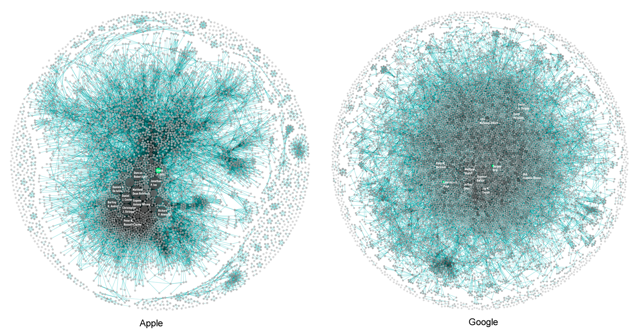
Co.Design has some very interesting graphic visualizations of patent filings by Apple (NASDAQ:AAPL) and Google (NASDAQ:GOOG) (NASDAQ:GOOGL). The visualizations (like the one shown above) were generated by Periscopic and are called "Innovation Signatures."
In the visualizations, each blob is a patent inventor, and the size of the blob is proportional to the number of patents the inventor has. Since many patents have multiple inventors, lines indicate common patents between co-inventors.
The visualizations for the respective companies suggest a deep-seated cultural difference, but what that might be is open to interpretation. Co.Design thinks the visualizations indicate more centralized control on the part of Apple management over the R&D process.
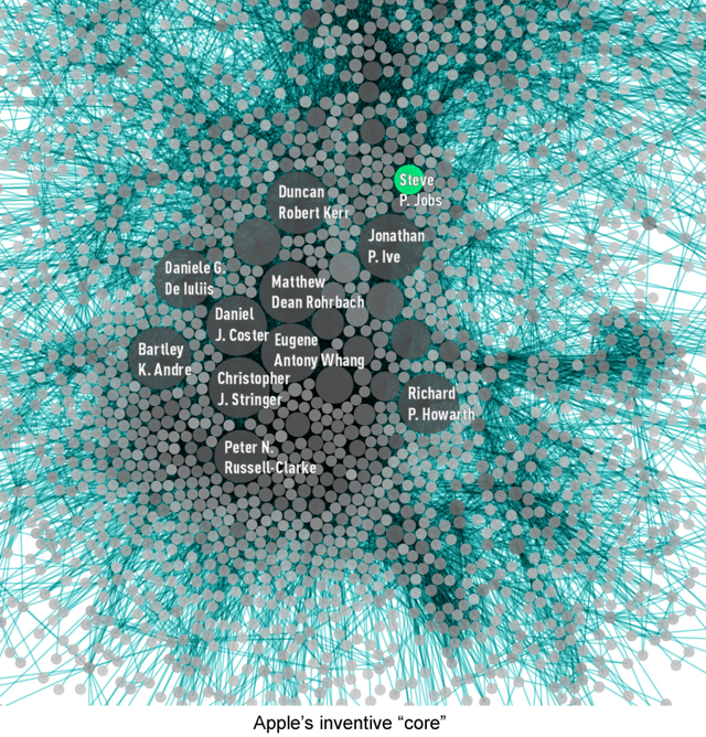
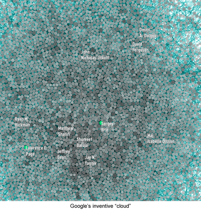
They give as an example the fact that Steve Jobs was granted 347 patents over a period of a decade compared to Sergey Brin and Larry Page who have a combined total of 27 over the same period.
While patents and by inference innovation appear to be more concentrated in the hands of the few at Apple, patents are more broadly dispersed at Google. This suggests that Google's organizational structure at least for R&D is flatter and less centralized than Apple's.
Co.Design points out that many of the prominent names in the Apple close-up above are subordinates of Jony Ive, such as Eugene Whang, Christopher Stringer, Bart Andre and Richard Howarth. Clearly, a very small group is generating a relatively large number of patents and this group is centered around the hardware design of Apple's products.
I find it curious because Apple is generally regarded as having a relatively flat managerial structure. Yet when it comes to R&D, innovation seems to be focused in a small group. This seems to be more a function of Apple's design focus than organizational structure.
Likewise, the large number of patents for Steve Jobs shows how important he was as Apple's de facto Product Architect. Jony Ive's prominence on the innovation map suggests that he has certainly tried to step into that role.
The innovation maps of both companies are surrounded by thin shells of patents disconnected from the central mass. This shell reflects patents owned by companies that were acquired by Apple or Google.
Overall, Apple has been more efficient in its innovation, generating 10,975 patents with a team of 5,232 inventors compared to Google's 12,386 patents generated by a team of 8,888. I believe that also reflects the impact of Steve Jobs. I have observed that the genius of Steve Jobs was in recognizing the marketable product latent in a given research project. Or, conversely, recognizing when research wouldn't lead to a product.
Jobs gave Apple the ability to get by on R&D budgets that were relatively small compared to Apple's industry peers. Following the departure of Jobs, Apple had to expand its R&D spending to compensate, and it has. Apple's R&D spending for fiscal 2016 was up 25% compared to 2015. This has given rise to concern that Apple might not be spending its R&D money efficiently, and probably Apple isn't as efficient as it was under Jobs.
Short of finding another Steve Jobs, Apple really had no choice but to take a "shotgun approach" to R&D. What's disturbing about the chart is the concentration in the design area given the fact that the design language of Apple's products hasn't changed much in recent years, and product designs have become very evolutionary. The design concentration of the innovation map suggests that Apple may not be efficient in its approach to visual design.
The innovation map also suggests that while Ive has stepped into the role of Product Architect, he has only emphasized the visual design aspects, according to his predilections and abilities. In that regard, I continue to think that Apple is still missing a true Product Architect in the Jobs' vein. The Product Architect that Apple needs is a technologist, but also a generalist, someone who cares about the underlying technologies as much as physical design, someone who cares as much about software as hardware as much about functionality as appearance.


No comments:
Post a Comment
Note: Only a member of this blog may post a comment.